Second, Spencer is not reporting official United States Historical Climate Network (USHCN) figures, but his own figures which use a larger Urban Heat Island (UHI) adjustment than do the official figures. While we cannot be certain as to the correct adjustment for UHI and other factors, recently the accuracy of the USHCN adjustments have been corroborated from an independent source.
Third, he is only reporting on two winter months. Individual months are always more variable than annual figures, which have some of the variations cancelled out be averaging. Consequently it is not surprising that a two month period should be unusually cold, even with the background of a warming trend. It makes such comparisons mere curiosities, having no bearing on the long term change in temperatures. Spencer shows a graph of his adjusted Integrated Surface Hourly (ISH) figures compared to the official USHCN figures:
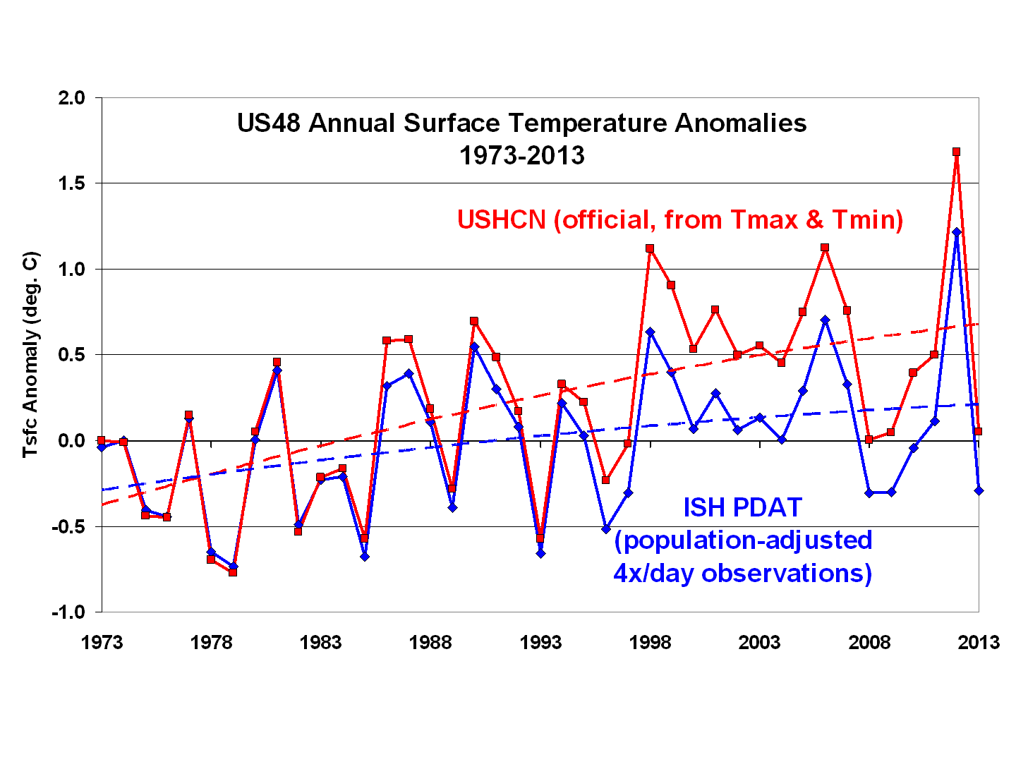
It can be seen clearly that Spencer's adjustment significantly cools later years relative to earlier years. Indeed, by 2013, it cools it by 0.35 C. As it turns out, that does not make a large difference in the ranking of 2013, which is the 13th coldest of 41 years in his adjusted figures, whereas it is tied for 15th and 16th coldest in the official USHCN data over that 41 years. Of course, the USHCN has many more years on record than just 41, and most of them much colder. Further, the early years of the 41 Spencer shows are obviously colder than the later years. Indeed, 8 of the first 15 years shown are colder than 2013.
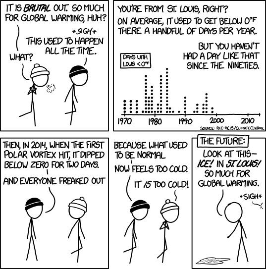
That brings to mind a recent comic by xkcd:
Which brings us to the December/January figures ;)
In those figures, Spencer shows that Dec/Jan of 2013/2014 have indeed been cold relative to the last 41 years, being the 6th coldest out of 41 years data. And it was indeed cold, at a chilly -0.55 C average for the CONUS. Of course, relatively warm relative to the -2.1 C in 78/79. And the years before that were colder still. What was commonplace has simply become note-worthy due to the warming climate. XKCD has it right.
(Note: This post is an edited and expanded version of an original comment at Skeptical Science.)
Tamino dissects another case" of mistaking the new normal for the twentieth century normal at Open Minds. It is a tragedy of our time, and a greater tragedy for our future that so many so uncritically mistake logical fallacies for reasoning.
ReplyDeleteFurther to the comment above, I have posted the following at Ambler's blog, and also at WUWT (with a slight introduction). Links to relevant data can be found in my comment at Open Mind:
ReplyDeleteNOAA provides a clear definition of what is meant by near normal, saying:
“The “Below Normal”, “Near Normal”, and “Above Normal” shadings on the color maps represent the bottom, middle, and upper tercile (or three equal portions) of the distribution, respectively.”
That means that for the 120 year record from 1895-2014, any division with a temperature ranking between 41st and 80th of those year years is “near normal”.
NOAA also provides a map showing the actual rankings of each division. Using the example of New England, we find that all divisions in New England, except for one in Connecticut (1st division, ranking 36th), have rankings between 42nd and 70th. They are, therefore, correctly classified by NOAA.
It is an apples to oranges comparison to look at anomalies when trying to rebut claims about rankings. The two will only be approximately related, and can be seen by comparing the map of anomalies to that of rankings from NOAA. It is, at best, astounding laziness to base a post on such an invalid comparison rather than actually comparing rankings. That laziness compounds to outright incompetence (at best) when you do not notice the anomaly you are using is for the 1981-2010 rather than the actual comparison period used in the rankings (1895-2014). (Note: Tamino uses the 1901-2000, the default period for anomalies in map linked above. That is still inaccurate for comparison, but far less so than the period used by Ambler.) For what it is worth, I have only verified the ranking of one New England division (Massachusetts Coastal, ie, the division including Boston)
The compounded errors of Ambler are bad enough. That superficial readings of Ambler are then used to justify vilification of NOAA and its employees shows much about the integrity of those making the accusations, and nothing about that of NOAA. Clearly they would rather vilify on the on checked word of a random blogger than actually check the facts, uncomfortable as those facts are to their world view.
I was so impressed by your contributions in the WUWT discussion thread that I had to come by and offer my thanks. Outstanding work from top to bottom, sir.
ReplyDelete